The following is a slide I might use to teach about interpreting a forest plot. What do you think about it? Will students learn deeply from it? (Would like to see a larger version of the slide? Please click on it)
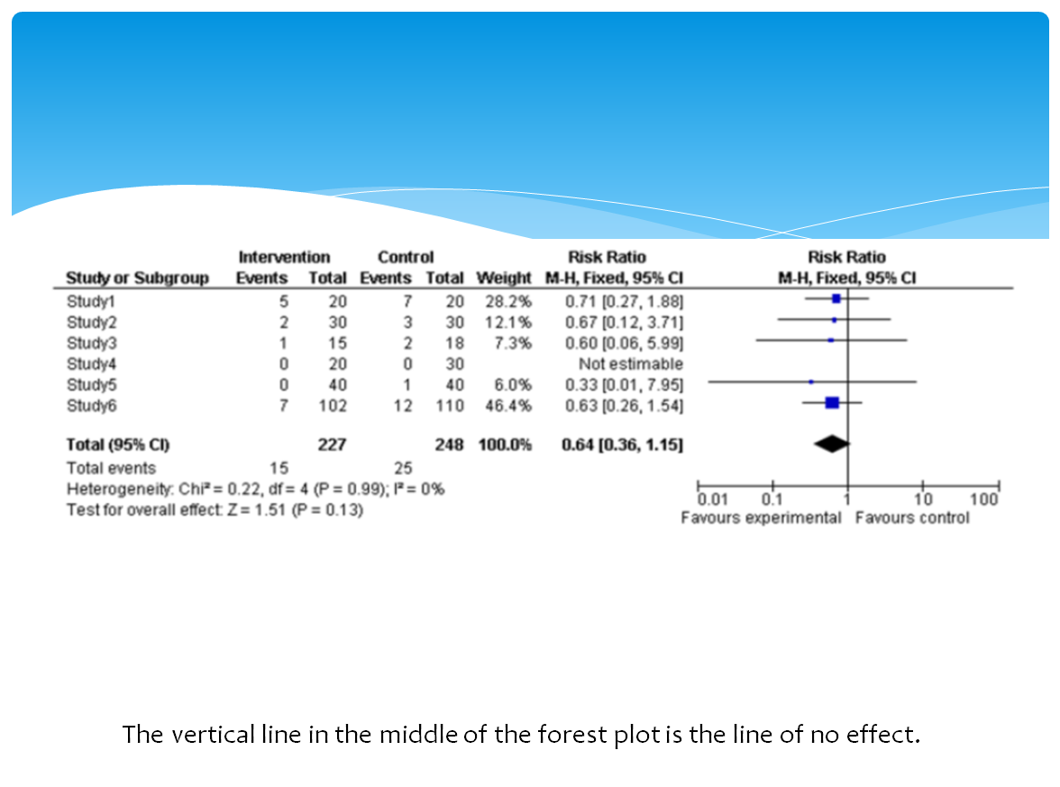
Version 1
Or do you think students would learn more deeply from this slide?
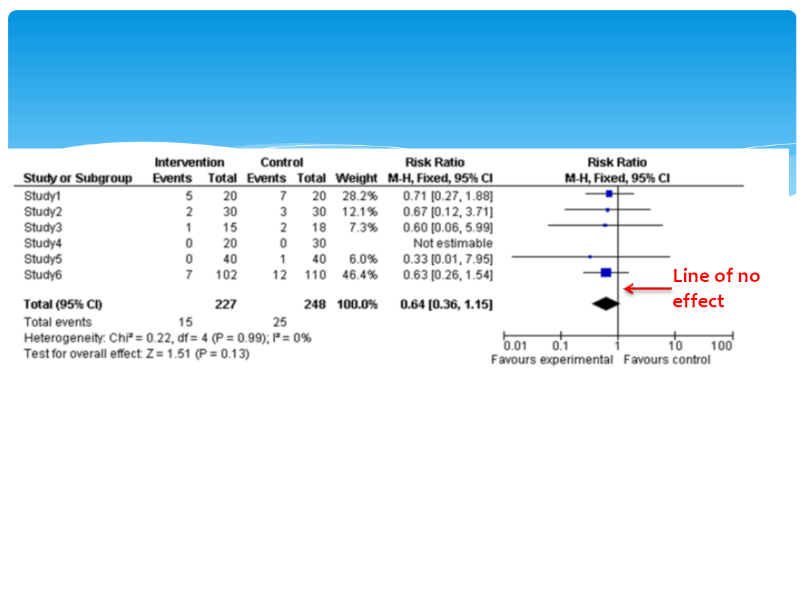
Version 2
Research would predict version 2 is better and will lead to deeper understanding. But why? What is different about them?
Version 1 violates the spatial contiguity principle which states that people learn more deeply from a multimedia message when corresponding words and pictures are presented near rather than far from each other on the page or screen. In version 1 the words describing the image are at the bottom of the slide. The learner will have to look away from the graphic to find this description and then hold it in working memory (remember working memory is limited in capacity and time it can hold an object) while he looks back to the image and tries to process them together. This can overload cognitive capacity and impair learning. Version 2, on the other hand, has the words right next to the corresponding graphic thus reducing cognitive work. This is especially important when words refer to parts of on-screen graphics.
Other common violations of the spatial contiguity principle include:
- Feedback is displayed on a separate screen from the practice exercise or question
- Directions to complete practice exercises are placed on a separate screen from the application screen
- Key elements of a graphic are numbered but the legend is at the bottom of the screen
Watch the following video about how to calculate the number needed to treat. Will students learn deeply from this video?
Research would predict they won’t because the instructor violated the temporal contiguity principle which states that people learn more deeply from a multimedia message when corresponding animation and narration are presented simultaneously rather than successively. Cognitive capacity will be overloaded because the learner has to hold all of the relevant words in working memory until the animation is presented. This principle is especially important when narration and animation segments are long and when students can’t control the pace of the presentation.
What’s the evidence for this? Mayer, in Table 12.7 in the Cambridge Handbook of Multimedia Learning (2014), summarizes 22 studies on spatial contiguity published through 2012 and finds an average effect size of 1.10 (effect sizes > 0.8 are significant, 0.5 are moderate). Table 12.8 summarizes 9 studies on temporal contiguity published through 2008 and finds an average effect size of 1.22. Thus, following the contiguity principle leads to deeper understanding.

I agree! Intuitively, the animation during the narration would be much better as a teaching tool. It brings me back to the wonders of a chalkboard. By the way, aside from the screen capturing software, are you also using a Wacom Bamboo pad or a mouse? It’s really accurate and precise.
I use screencast-o-magic software and a Wacom bamboo tablet (pen included with tablet).
This is excellent stuff, Terry!! I am always looking for ideas on how I can communicate better when I teach and write articles.
I think there are so many popular youtube videos with animated drawings and explanations.. I find the drawings a bit distracting beacuse it is external as in your slide and is not adding to the content I feel.
Thanks again!